- 在组件的 wxml 中以 slot 节点开启一个占位符,用于承载组件使用者提供的 wxml 结构
- 默认情况下,一个组件的 wxml 中只能有一个 slot 。需要使用多 slot 时,可以在组件 js 的选项 options 中声明启用
- 多个 slot 必须使用不同的 name 加以区分
Component({
    properties: {},
    data: {},
    methods: {},
    options: {
        multipleSlots: true
    }
})
单插槽应用
[] 改进版权信息组件 copyright,增加一个 slot 接收使用者提供的 wxml,如使用图像组件
- 在组件中预留/创建插槽,调整结构如下
- 调整样式为弹性盒子垂直居中对齐;因为不确定使用者传递的是什么结构,所以不能指定插槽的样式
- 使用组件时,引入并使用组件,传递图像内容
- 使用者指定图像样式
<view class="copy">
    <slot></slot>
    <text>copyright 2023-2024</text>
</view>
.copy {
    display: flex;
    flex-direction: column;
    justify-content: center;
    align-items: center;
}
<view class="copy">
    <copy>
        <image class="img" src="../../utils/marker.png" mode="aspectFill" />
    </copy>
</view>
.img {
    width: 50px;
    height: 50px;
}
多插槽应用
[] 改进版权信息组件copyright,再增加一个 slot 接收使用者的学号
- 在组件 js 选项中,启用多插槽 - 不是在 .json
- 在组件中预留/创建插槽,分配名字,调整结构如下
- 目标组件引入,使用 slot 指定插槽名称,并传递相应的内容
Component({
    properties: {},
    data: {},
    methods: {},
    options: {
        multipleSlots: true
    }
})
<view class="copy">
    <slot name="img"></slot>
    <text>copyright 2023-2024</text>
    <slot name="sn"></slot>
</view>
<view class="copy">
    <copy>
        <image slot='img' class="img" src="../../utils/marker.png" mode="aspectFill" />
        <text slot='sn'>20221081</text>
    </copy>
</view>
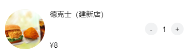
[] 商品组件 product
- 插槽组件:使用2个插槽
<view class="img">
    <image src="https://glpla.github.io/utils{{product.image}}" mode="aspectFill" />
  </view>
  <view class="info">
    <view class="title">{{product.title}}</view>
    <view class="price">
      <text>¥<text class="txt-bold">{{product.price}}</text></text>
      <slot name="extra"></slot>
    </view>
  </view>
  <slot></slot>
</view>
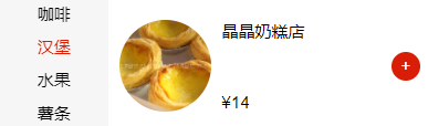
<product product="{{item}}">
    <view class="btn-oper add" catch:tap="addToCart" data-id="{{item.id}}" data-item='{{item}}'>+</view>
</product>