Introduction
- 元素从一个状态过渡到另外一个状态 - define the transition between two states of an element,包括过渡的2个状态、过渡的时间、过渡的方式、是否延迟等属性
- 状态过渡需要一个触发条件,通常是鼠标悬停 hover;也可以通过添加/移除类的方式实现
- 只能定义2个状态:开始状态、结束状态;如果需要多个状态呈现变化过程,请使用 帧动画
- 只适用于 数值 属性状态的变换;如 display:none; 和 display:block; 之间无法实现过渡
- 只能作用于当前元素的状态变换;如果多个元素使用,请使用帧动画
- 可以是一个属性的状态变换,也可以是多个属性的状态变换,如宽度和颜色都变换;多个属性使用 逗号, 分隔 - separated by commas
- 桌面端使用较多;移动端使用少
- 更多细节,请参考 MDN - transition、Using_CSS_transitions
Syntax
transition: property duration timing-function delay;
单独属性 longhand
transition-property:
transition-duration:
transition-timing-function:
transition-delay:
常用动画属性如下
过渡属性
| item |
desc |
| property |
元素参与过渡的属性,必须是 数值型 的属性
通常指定为 all;建议 指定为特定属性
|
| duration |
过渡持续时间,单位秒 s 或毫秒 ms,必选参数,且必须是第一个时间参数;第二个时间参数是延迟时间
UI界面的过渡通常不超过 0.4s
|
| timing-function |
时间函数,过渡的效果/方式
默认是 ease
|
| delay |
过渡延迟时间,必须是第二个时间参数;第一个时间参数是过渡时间 |
时间函数 timing-function
| item |
desc |
| linear |
以相同速度开始到结束( cubic-bezier(0, 0, 1, 1) ) |
| ease |
默认;开始慢,然后快,慢下来,结束时非常慢( cubic-bezier(0.25, 0.1, 0.25, 1)) |
| ease-in |
开始慢,结束快( cubic-bezier(0.42,0,1,1) |
| ease-out |
开始快,结束慢( cubic-bezier(0,0,0.58,1) |
| ease-in-out |
中间快,两边慢( cubic-bezier(0.42,0,0.58,1) |
| cubic-bezier(n,n,n,n) |
在 cubic-bezier 函数中定义自己的值;更多使用,请访问 Easing Wizard |
| steps() |
步进方式变换,见后续内容 |
Usage
.demo {
  background-color: #ccc;
  transition: 1s;
}

.demo:hover {
  background-color: #f40;
}
指定属性过渡 - 部分属性需要指定才可以;强烈建议
.demo {
  background-color: #ccc;
  transition: background-color 1s;
}

.demo:hover {
  background-color: #f40;
}
分别指定不同阶段过渡
过渡大多数情况下写在开始状态,也可以写在结束状态,还可以在两个状态中分别指定过渡:配合不同的时间,实现特定的效果,如快进慢退
过渡自动双向执行:只要状态翻转,过渡就会执行;为了避免这种情况,在结束态指定过渡
多级元素使用过渡时,可能导致页面渲染延迟,调整过渡到结束状态即可
.demo {
  background-color: #ccc;
  transition: background-color 1s;
}

.demo:hover {
  background-color: #f40;
  transition: background-color 3s;
}
多个属性分别过渡;使用单独属性语法可以指定多个过渡属性,必须是一一对应
.demo {
  background-color: #ccc;
  font-size: 16px;
  transition:
    background-color 1s,
    font-size 1s;
}

.demo:hover {
  background-color: #f40;
  font-size: 20px;
  transition:
    background-color 1s,
    font-size 1s;
}
多个属性带延迟分别过渡
.demo {
  background-color: #ccc;
  font-size: 16px;
  transition:
    background-color 1s,
    font-size 1s;
}

.demo:hover {
  background-color: #f40;
  font-size: 20px;
  transition:
    background-color 1s,
    font-size 1s 1s;
}
案例 Cases
[] 鼠标悬停类 :hover - 改变背景颜色、背景图片、背景大小等等
[] 聚焦类 :focus - 多见于表单;获取焦点时,通过定位 position 或变换 transform
移动元素
[] 选中类 :checked - 多见于表单的单选按钮或多选按钮的设计
[] 事件类 - 单击时,为元素添加动态类,进而改变样式
[] 个人信息卡 - 慢进1s快退0.5s
.info-card img {
  position: relative;
  z-index: 1;
  transform-origin: left top;
  transition: .5s;
}

.info-card:hover img {
  transform: scale(0.8);
  transition: 1s;
}
[] 图片大小变化
. 标题位置变化:开始定位在元素外部,hover时定位在元素底部
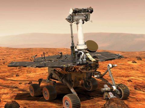
祝融号火星车
.mars .img {
    transform-origin: top;
    transition: .4s;
}

.mars:hover .img {
    transform: scale(.5);
}

.mars .info {
    position: absolute;
    left: 0px;
    bottom: -60px;
    //......
    transition: .4s;
}

.mars:hover .info {
    bottom: 0px;
}
[] 旋转过渡:把元素的旋转点调整到左上角
.rot div {
    position: absolute;
    left: -230px;
    top: -230px;
    width: 80%;
    height: 80%;
    border: 10px solid #b22222;
    transform-origin: left top;
    transition: 1s;
}

.rot:hover div {
    left: 10%;
    top: 10%;
    transform: rotate(360deg);
}
[] 伪元素旋转位移
.tran div::after {
    content: '';
    position: absolute;
    left: 0;
    bottom: -180px;
    width: 320px;
    height: 180px;
    background-color: #fff;
    transform-origin: left top;
    transition: 1s;
}

.tran div:hover::after {
    transform: rotate(-20deg);
}
[] 伪元素缩放
hover查看
- 伪元素分别设置上下边框
- 需要显式的设置初始状态为0
.border::before {
    content: '';
    position: absolute;
    left: 50%;
    top: 50%;
    width: 60%;
    height: 50%;
    border: solid #b22222;
    border-width: 4px 0;
    transform: translate(-50%, -50%) scaleX(0);
    transition: .4s;
}

.border::after {
    content: '';
    position: absolute;
    left: 50%;
    top: 50%;
    width: 50%;
    height: 60%;
    border: solid #b22222;
    border-width: 0px 4px;
    transform: translate(-50%, -50%) scaleY(0);
    transition: .4s;
}

.border:hover::before {
    transform: translate(-50%, -50%) scaleX(1);
}

.border:hover::after {
    transform: translate(-50%, -50%) scaleY(1);
}
步进 Steps
说明
- 由时间函数 steps() 指定的一种特殊的分段过渡效果
steps(number_of_steps,direction)
number_of_steps:数字,过渡分几个阶段完成
direction:start 和 end,默认是 end,指每个阶段过渡结束后才渲染;start 则是过渡开始前就渲染
矩形的宽度从0px,经过5个阶段,过渡到200px:0-40、40-80、80-120、120-160、160-200
- 这里使用 :hover 模拟加载情况
- 先加载再更新,所以应使用默认的 end 方向
- 静态和动态分别使用不同的过渡效果
.loading {
    display: flex;
    width: 300px;
    height: 40px;
    border: 1px solid #f40;
    padding: 4px;
    margin: 100px auto;
}

.loading::before {
    content: '';
    width: 0%;
    height: 100%;
    background-color: #f40;
    transition: width 1s linear;
}

.loading:hover::before {
    transition: width 5s steps(5);
    width: 100%;
}
事件 Events
. 侦听过渡动画的执行过程
事件 Events
| item |
desc |
| transitionstart |
动画开始 |
| transitionrun |
动画运行 |
| transitionend |
动画结束 |
| transitioncancel |
动画取消 |
el.addEventListener("transitionstart", (event) => {});
el.addEventListener("transitionrun", (event) => {});
el.addEventListener("transitionend", (event) => {});
el.addEventListener("transitioncancel", (event) => {});
[
] 动画结束后,切换页面;更多案例,请访问
表单
返回主页
const wrap = document.querySelector('.demo-wrap');
const btn = document.querySelector('.btn');
btn.addEventListener('click', () => {
  wrap.classList.toggle('active');
})
wrap.addEventListener('transitionend', () => {
  if (wrap.classList.contains('active')) {
  }
  window.location.href = './index.html';
})
总结和作业 Summary & Homework
Summary
. 过渡动画的基本使用
Homework
- 独立完成上述案例
- 利用过渡动画,完善个人网站,如导航过渡效果;个人信息过渡效果等等