.更灵活:支持二维布局:对列和行进行布局
.类似早期的 table 布局;table 本来是做数据展示的,所以在布局上有明显的缺陷:非语义化、布局代码冗余,以及不好维护、渲染性能等问题,目前 table 布局已被抛弃
容器 container
子项 item
单元格 cell
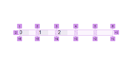
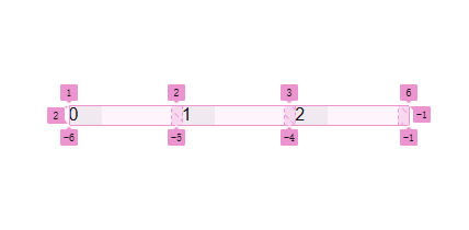
轨道 track
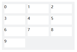
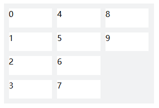
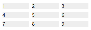
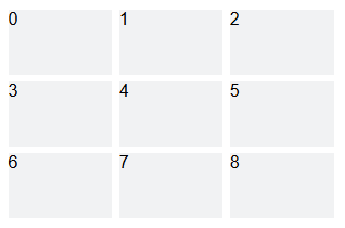
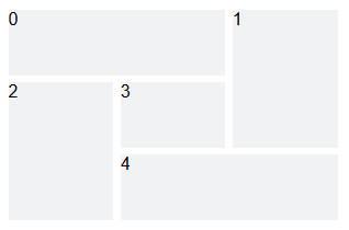
<div class="wrapper">
    <div>Item One</div>
    <div>Item Two</div>
    <div>Item Three</div>
    <div>Item Four</div>
    <div>Item Five</div>
</div>
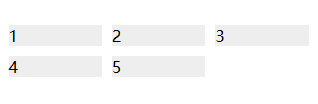
.通过声明 grid 使得 .wrapper 成为一个 container;容器的直接后代|子元素 <div> 则变为 item
.wrapper {
    display: grid;
}
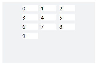
.通过划分列数 grid-template-columns 和行数 grid-template-rows,将容器 container 划分为一个一个格子
cell
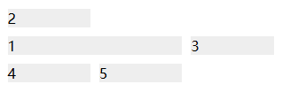
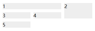
.子项 item 就被放置这些格子中。每个格子被轨道 track 标记,行 row 从上到下为1,2,...;列 column 从左到右为1,2,...
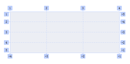
网格轨道
F12查看
颜色随机