背景

@Background
. 为元素指定背景颜色,可以同时指定背景图片、大小、位置、铺贴方式等
. 背景 background 样式包含多个属性
. 通常使用独立属性;也可以使用复合属性,但是可读性不好,不建议
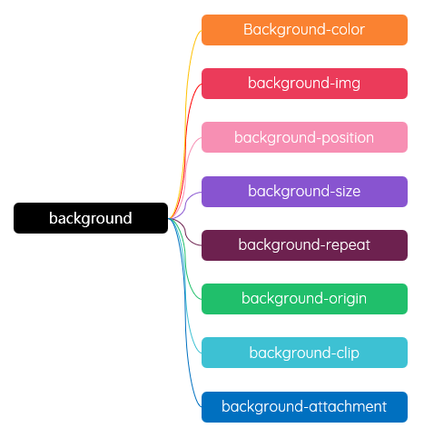
background:bg-color bg-image position/bg-size bg-repeat bg-origin bg-clip bg-attachment initial|inherit;
背景思维导图
背景色 Background-color
. 为元素设置背景 颜色 - Color;可以使用透明色 transparent
. 为了后向兼容/容错 fallback options,指定背景图片的同时,建议也指定颜色;俩者互不冲突;通常结合在一起使用
. 指定背景颜色还可以提升用户体验,避免大图片加载时的页面空白
[] 背景颜色使用示例
background-color: tomato;
background-color: #ff6347;
background-color: #f40;
background-color: rgb(255, 99, 71);
background-color: rgba(255, 99, 71, .6);
background-color: hsl(9, 100%, 64%);
background-color: hsla(9, 100%, 64%, .8);
背景图片 Background-image
. 可以使用传统的图片作为背景,也可以使用 渐变背景 - 线性渐变、径向渐变、锥向渐变 创建背景图片
. 可以使用多个背景图片,使用 逗号; 分隔;先指定的图片会在前面
. 应用非常广泛。如使用透明色渐变添加蒙版、百叶窗等
[] 有了 <img>,为什么还需要使用这个属性?
. 装饰型元素 多使用 Background-image
. 功能性元素 多使用 <img>;或者说如果去掉图片仍能正常表达主题就使用 Background-image,否则应使用 <img>
background-img: url(./imgs/1.jpg);
background-img: url(https://images.unsplash.com/...);
background-img: linear-gradient();
background-img: radial-gradient();
background-img: conic-gradient();
background-image: linear-gradient(transparent, #000), url(./imgs/2019middle.jpg);
背景图片位置 Background-position
. 根据图片坐标/位置显示指定的内容;默认从左上角开始 - relative to the edges of an element's box
. 可以使用关键字,如 top、left、right、bottom
. 也可以使用具体数字 length 或百分比 percentage
. 还可以关键字和数字、百分比组合使用
. 如果只指定了一个方向,另外一个方向默认是 center 或 50%
背景图片大小 Background-size
. 背景图片的大小
background-size: contain | cover | auto | length | percentage
. contain:包含图片,即 完全 显示图片;元素背景易出现留白 - Scales the image as large as possible within its container without cropping or stretching the image
. cover:等比例最大化 显示图片;元素背景被占满、图片可能被裁剪 - leaving no empty space
. percentage:参考元素大小设置背景图片大小;200%就是2倍的元素大小;50%就是元素的一半
. length:固定数值设置背景图片大小
. 默认情况下,背景图片按照图片原始大小显示;当元素尺寸和背景图片尺寸不一致时,就会出现背景图片重复铺贴或背景图片被裁剪的情况
. 元素尺寸 > 背景图片的尺寸,则默认情况下,背景图片会在水平和垂直方向上重复贴铺
. 元素尺寸 < 背景图片的尺寸,图片被裁剪/部分显示;实际上背景图片还是会在水平和垂直方向上重复铺贴,只不过受元素大小限制,没有呈现出来
. 可以指定2个参数:宽、高;通常只指定宽,高为auto,系统会按照图片比例,自动调整背景图片高度
[] 背景图片大小 - 示例图片大小为640*427
.size {
width: 320px;
height: 180px;
background-image: url(../imgs/bg.jpg);
background-size: ;
}
使用 cover 时,配合位置 background-position,确保图片的重点内容/热区凸显
背景图片重复 Background-repeat
. 背景图片重复铺贴
. 如果图片尺寸大于容器尺寸,看不出重复效果;实际上也是重复铺贴了的
background-repeat: repeat | no-repeat | repeat-x | repeat-y;
. repeat:默认情况下,图片会水平和垂直方向上铺满整个容器
. no-repeat:不重复;如果指定图片的位置,必须取消重复
. repeat-x:x轴重复
. repeat-y:y轴重复
背景图片 background-image[NOT背景颜色 background-color]使用/渲染时的起点位置/原点位置
background-origin: padding-box | border-box | content-box;
. padding-box:默认值;背景图片从 padding 区开始渲染,border 区不会出现;如果有背景色,则默认会在 border 区出现
. border-box:背景图片从 border 区开始渲染;可创建透明边框效果
. content-box:背景图片只会出现在内容区域,padding 和 border 都不会出现
[] background-origin 示例
.bg-origin {
    width: 320px;
    height: 180px;
    border: 20px dashed rgba(255, 255, 255, 0.8);
    padding: 20px;
    background-image: linear-gradient(45deg, #ff0, #f00);
    background-size: cover;
    background-origin: ;
    margin: 1rem auto;
}

背景[背景颜色 背景图片]的延申什么位置 - extends underneath

background-clip: border-box | padding-box | content-box | text;
1. border-box
背景延伸至边框外沿(但是在边框下层);默认属性
背景显示拓展到border区域下面;超出border区的背景将被裁剪掉
如果有border,则border会覆盖背景;换句话说,背景填充到border区,只不过被border覆盖住了
设置一个dashed的border就可看到背景是在border的下方
2. padding-box
背景延伸至内边距(padding)外沿。不会绘制到边框处
背景显示拓展到padding区域;超过padding区的背景将被裁剪掉
3. content-box
背景被裁剪至内容区(content box)外沿
背景显示在content区域下面;超过context区的背景将被裁剪掉
如果有padding,但是只指定了background-image而没有指定background-color,则padding区为默认的白色
所以保险起见,通常要设置一个背景色,避免background-image无效
4. text
背景被裁剪成文字的前景色
文字颜色设置为透明色,创建带背景的文字效果
尽量不要使用文字阴影 text-shadow,而应该使用滤镜 filter 的 投影 drop-shadow() 添加层次效果
[] background-clip 示例
.bg-clip {
    width: 320px;
    height: 180px;
    line-height: 100px;
    font-size: 40px;
    font-weight: 600;
    border: 20px dashed rgba(255, 255, 255, 0.8);
    padding: 20px;
    background-color: #ff0;
    background-image: linear-gradient(45deg, #ff0, #f00);
    background-size: cover;
    background-clip: ;
    margin: 1rem auto;
}
hello, world.
. 背景图片是固定在视口viewpoint还是随窗口容器滚动;即背景图片和元素的附着方式
. 多用于营造视觉差效果
background-attachment: scroll | fixed | local; 
. scroll:默认背景图片会随着窗口/页面滚动而滚动;背景图片和自己保持固定;自己滚动不影响,别人滚动会影响
. fixed:背景图片不会随着窗口/页面滚动而滚动背景,即:背景图片固定不动/相对于视口固定
. local:背景图片会随着元素内容的滚动而滚动
[] 默认情况
. 背景图片不跟随内容滚动;但跟随窗口/视口滚动:整体滚动

Lorem ipsum dolor sit amet consectetur adipisicing elit. Blanditiis at nostrum fugiat ratione reprehenderit eius officia, tempore voluptatum incidunt nihil, iusto laborum? Cupiditate autem ipsam illum totam excepturi aliquam sit.

Lorem ipsum dolor sit amet consectetur adipisicing elit. Iure, doloribus libero at nihil temporibus ipsa quisquam, nulla sapiente voluptates fuga, porro sequi unde labore explicabo. Unde dolore omnis distinctio molestias?

.bg-attach-default {
    overflow-y: auto;
    background-image: url(../imgs/bg.jpg);
}
[] 固定
. 背景图片不跟随内容滚动,但是相对窗口/视口固定
. 参考页面顶部

Lorem ipsum dolor sit amet consectetur adipisicing elit. Blanditiis at nostrum fugiat ratione reprehenderit eius officia, tempore voluptatum incidunt nihil, iusto laborum? Cupiditate autem ipsam illum totam excepturi aliquam sit.

Lorem ipsum dolor sit amet consectetur adipisicing elit. Iure, doloribus libero at nihil temporibus ipsa quisquam, nulla sapiente voluptates fuga, porro sequi unde labore explicabo. Unde dolore omnis distinctio molestias?

.bg-attach-local {
    overflow-y: auto;
    background-image: url(../imgs/bg.jpg);
    background-attachment: local;
}
[] 本地
. 背景图片跟随内容滚动;跟随窗口/视口滚动
. 背景图片通常需要重复

Lorem ipsum dolor sit amet consectetur adipisicing elit. Blanditiis at nostrum fugiat ratione reprehenderit eius officia, tempore voluptatum incidunt nihil, iusto laborum? Cupiditate autem ipsam illum totam excepturi aliquam sit.

Lorem ipsum dolor sit amet consectetur adipisicing elit. Iure, doloribus libero at nihil temporibus ipsa quisquam, nulla sapiente voluptates fuga, porro sequi unde labore explicabo. Unde dolore omnis distinctio molestias?

.bg-attach-local {
    overflow-y: auto;
    background-image: url(../imgs/bg.jpg);
    background-attachment: local;
}
案例 Cases
[] 带背景的登录表单
[] 带背景的表格
[] 头像
[] 定制下拉菜单
[] 精灵图 - sprite - 也叫雪碧图;一个图整合多个图形元素,用于减少图片的网络请求;利用位置显示指定的部分;早期应用较多。随着互联网的提速和字体图标的广泛应用,现在基本不用了
[] 屏风图 - screen - 多个元素分别显示同一张图的不同部分,即利用位置显示不同的部分,最后拼接为完整的图片
[] 模拟目录页 - 水平方向平铺;可以使用使用普通元素或 伪元素
.item::before {
  content: '';
  flex: 1;
  height: 3px;
  background-image: url(../imgs/dot.png);
  background-repeat: repeat-x;
  order: 1;
}      
[] 多背景 - 背景图片分别定位于左上角和右下角;更多案例,请访问 Web首页
1. 独立属性 - 图片属性要一一对应
.multi-img {
    height: 200px;
    background-color: rgba(255, 68, 0, 0.4);
    background-image: url(../imgs/lg.png), url(../imgs/glc.png);
    background-position: right bottom, top left;
    background-size: 50px;
    background-repeat: no-repeat;//MUST
}
2. 复合属性 - background-color 放在后面;可读性差
background: url(../imgs/logo0.png) right bottom/50px no-repeat, url(../imgs/logo1.png) top left/50px no-repeat;
[] 多背景 - 遮罩图;在一个背景上叠加一个透明的背景,可以使用渐变背景
.img {
  width: 800px;
  height: 600px;
  background-image: linear-gradient(transparent, #000), url(./imgs/2019middle.jpg);
  background-size: cover;
}        
[] 多背景 - 百叶窗;自动重复
[] 如果指定位置 position 和不重复 no-repeat 会怎么样?
.img {
  width: 800px;
  height: 600px;
  background-image: linear-gradient(transparent, #000), url(./imgs/2019middle.jpg);
  background-size: 100% 6px, cover;
}        
[] Banner滑动按钮背景变化
背景图片要大于元素尺寸
静态时,背景图片定位在left;hover时定在right;借助 过渡动画 - transition 丝滑实现
  header {
   // ...
    background-position: left center;
    transition: 0.4s;
  }
  
  header:hover {
    background-position: right center;
  }
[] 抽屉相册
. 分别使用 <img> 和 background-img 并借助 :hover 和 弹性盒子 - flex 实现
[] 折角/狗耳朵[进阶]
折角/狗耳朵
.dog {
    position: relative;
    background-image: linear-gradient(210deg, transparent 3em, #ddd 0);
    border-radius: 1em;
    overflow: hidden;
}

.dog::before {
    content: '';
    position: absolute;
    width: 100%;
    height: 100%;
    background-image: linear-gradient(-120deg, #888 3em, transparent 0);
    border-radius: 1em;
    transform-origin: top right;
    transform: rotate(150deg) translate(5em, -3em);
}
总结与作业 Summary & Homework
总结
. 背景 background 的使用
作业
. 优化个人网站中的图片使用